What is responsive design?
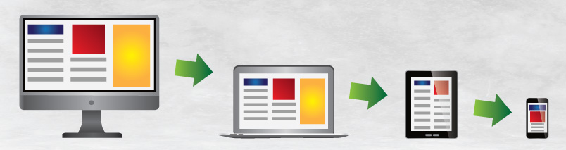
Responsive design is a method of adjusting your design to optimize the experience for all users — from desktop and laptop users to tablet and smartphone users.
The standard for websites
Responsive design refers to a website’s layout and content changing, depending on the size of the user’s viewing screen. This adjustment optimizes a web experience for all users — from desktop and laptop users to tablet and smartphone users. The content may be the same regardless of the size of the device. However, the way the content is laid out and accessed may differ. Or there may be a limited subset of content available on smaller screens to present only the features mobile users would access.
To see responsive design in action, reduce the size of your browser window while viewing this web page — and then pull it back out — and see how the content display changes depending on the screen size. Or view the same page on a smartphone and then on a tablet device. The Scott Design website is created with a responsive design using a “liquid layout,” where content readjusts to the size of the viewing screen much like a liquid changes shape to fill containers of different sizes.
Responsive design is becoming the standard as organizations realize that they must meet the needs of the growing number of smartphone and tablet users. Most smartphone users appreciate the responsive design approach since it allows them to see a page’s content with easy scrolling rather than constantly pinching the screen and swiping around to see content.
Instead of responsive design, some sites provide mobile-specific versions of the site, but that strategy — one site with one set of content for laptop/desktop and a separate site with different content for mobile/tablet — requires more time and resources to update the site. And when new sizes of viewing screens are developed in the future, a responsive site will be ready to display content at that new size without creating a new static-sized site.