Pharma Research Company Redesign

Our client’s story

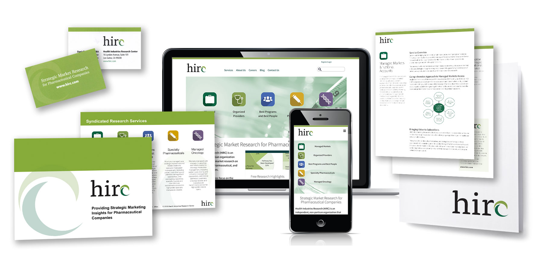
Scott Design had worked with HIRC, a pharmaceutical research company, on a website redesign, and was thrilled to be called in when they needed a new logo as part of a corporate rebranding. The previous logo had been in use since the company’s founding, and the management team wanted to keep some of the conceptual elements of the original logo, but create a brand-new, modern version.
Scott Design presented a series of logo design options to HIRC and they quickly narrowed the options down and selected a new logo that incorporates a stylized wave, which is a call back to the wave in the old logo. The new design also features a lowercase version of the company’s initials, with the wave standing in for the last letter. A fresh color palette and clean templates for everything from business cards to PowerPoint presentations to case studies completed the corporate redesign.