Developing sites for multiple browsers
In the past week, the latest versions of Internet Explorer, Firefox, and Chrome were released. Whenever a new release comes out, it’s a good time to determine which browsers you should worry about when creating a website, as browser usage varies over time.
Web development in an ideal world
In an ideal world, you would be able to create your site using HTML, CSS, JavaScript, and any other necessary technologies and your site would look great in any browser. The reality is that each browser and operating system has its own quirks, and the only way to make sure your site works on any given platform is to test it there. It is important to prioritize for which browsers you’re going to perfect your code, as there is a seemingly endless number of browsers out there, and with mobile browsers and tablets growing in use, you should focus on where most of your site visitors will be seeing your website.
Desktop browsers
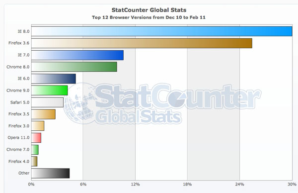
There are a few sites on the web where you can find statistics on which browsers are most commonly used. StatCounter.com interactive graphs are a great way to see the top browsers by date and location. As you can see by the graph below, only four browsers (Internet Explorer, Firefox, Chrome, and Safari) account for more than 90% of browser usage worldwide. It’s therefore essential that you test your site in the latest versions of these top four current browsers.

Mobile browsers
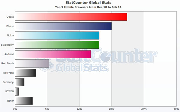
In addition, you should find out whether your site visitors are often using another platform, such as mobile devices, to access your site. In that case, it’s important to test your site on mobile browsers, as well. Again, as shown in the chart below, the top six browsers account for 85% of mobile browser use, so you should concentrate your refinements on these browsers. And just for perspective, desktop browsing still accounts for more than 95% of all browsing worldwide. You should verify that your site is being accessed often on mobile devices before spending a lot of effort to make sure your site works on mobile browsers. For more on what’s involved with developing a mobile-only version of your site, see How is web development different for mobil devices?

Special Requirements
Sometimes your site might have to work in a particular browser that’s not necessarily on the “most popular” list. For example, a sales force might need to access the site from mobile devices all the time, there may be a specific browser version installed on a corporate network, or the site might require some special technology that works best in a certain browser. Be sure to have a handle on all the required browsers and platforms before beginning your site development and design.
Prioritizing your web development work
With site visitors viewing your site on different browsers and devices, you have to plan for multiple browsing experiences when designing and building your site. In general, when we develop a site, we plan on the following browsers on Windows and MacOS devices:
- Internet Explorer 6.0 (or later)
- Firefox 3.0 (or later)
- Safari 5.0 (or later)
- Chrome 8.0 (or later)
We also test to make sure the site looks acceptable on the following mobile devices:
- Android, iPhone, and RIM
- iPad

The goal: a single site that works everywhere
 The site might not look the same on all different browsers and devices, but you should come up with solutions for each platform to ensure “cross-browser” compatibility. It’s worth taking the time to make your site look good in as many browsers as practical, since some users are averse to upgrading while others are early adopters of new browsers. If you want to include other browsers and platforms, be sure to leave enough time to customize and test your code on those browsers.
Your goal should be to make your site usable on a range of platforms to keep your visitors happy.
