5 rules of great B2B design
What makes a B2B design attractive, effective, and successful?

At Scott Design, we’re entering our 25th year in the business of designing B2B marketing pieces — everything from websites to emails to banner ads to brochures and more. We thought it would be good to look at what makes B2B design attractive, effective, and successful.
The purpose of any design is to convey a message to an audience through the arrangement of visuals and type. The goal is to create something that is visually appropriate, understandable, attracts attention, and communicates to the viewer. Great B2B design happens when all of this occurs within the structure of corporate branding, cost considerations, technical limitations, and time pressures.
A truly effective B2B design is one that can work within all the real bounds of the design constraints, yet be interesting and clear enough to reach an audience and move a viewer to act.
Sometimes design has to be over-the-top, with bright colors, loud type, and humorous visuals in order to catch attention in a crowd of messages, especially in B2C marketing and advertising. This is rarely the case for B2B designs, which need to stand out, but not stick out like a sore thumb.
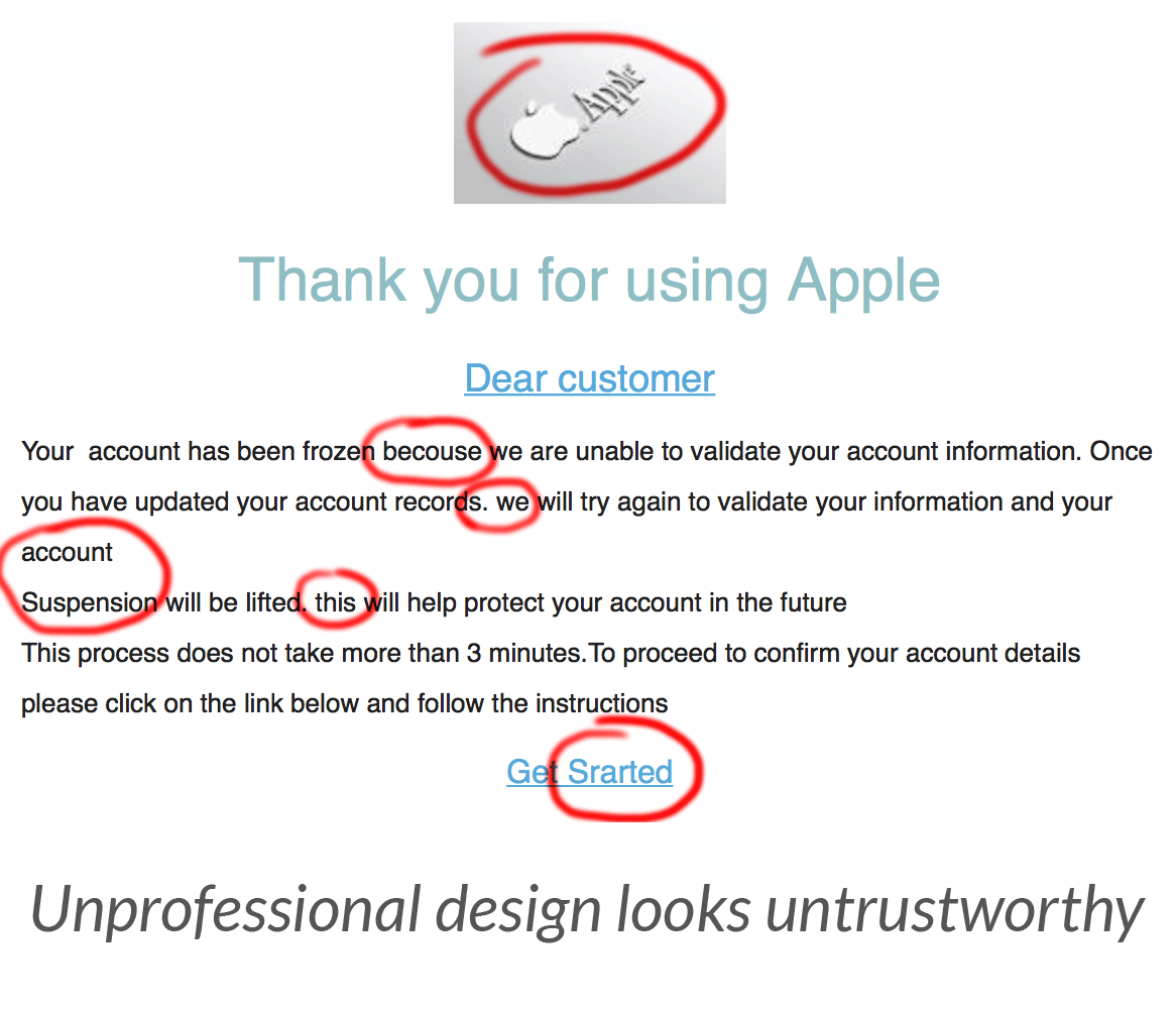
And, professional design, proofreading, and layout are essential. Think of every piece of phishing spam you’ve gotten and how easy it was to spot as a fake: bad layout, colors that weren’t quite right, wrong logo, bad editing.
1. B2B design should support the marketing message.
A design piece has a job to do and a distracting design can make viewers focus on the design instead of the message. Every graphic should be there for a reason: to inform, to visually support the message, to generate a sale. Extraneous visuals are just decoration, not design.
2. B2B design should help viewers find what they’re looking for…quickly.
Simple hierarchy and clear structure both in visuals, type, and layout, help users find the information they need and guide them where you want them to go. Overly complicated navigation, an unfamiliar interface, and clever copy that isn’t direct can drive a prospect to look elsewhere for solutions to their problems.
3. B2B designs are polished and professional.
Professional layout, typography, copywriting, proofreading, color, and visuals create trust. Typos, unexpected colors, amateurish layout, or mismatched graphics can make viewers think the piece wasn’t created by your company.
4. B2B designs must work within the larger framework of a company’s brand.
This doesn’t mean everything has to look the same, just that when put side-by-side, two pieces should look like they’re from the same company. This design consistency helps to build brand recognition and lets you focus on creating better content, not new visual styles. Veer too far from the corporate style and you lose the connection to your brand.
5. B2B design should serve the goal.
There are many solutions to any design problem, but the key to successful design is to create pieces that further marketing objectives. A great-looking design that doesn’t get results is a lost opportunity.
Styles may change, the media used to convey marketing messages may evolve, but good design still follows the same basic rules. Marketing pieces should support the message and goals of any campaign through professional design that works within a company’s visual brand.