Double spaces after a period
I’m not saying it’s wrong, but if you insist on putting two spaces between sentences, you should know what it says about you.
Two hotly debated articles in the past few years have tackled the topic of how many spaces should come after a period. In “Space Invaders: Why you should never, ever use two spaces after a period,” Slate author Farhad Manjoo says “Can I let you in on a secret? Typing two spaces after a period is totally, completely, utterly, and inarguably wrong.”
This was followed by a post by Heraclitean River titled “Why two spaces after a period isn’t wrong (or, the lies typographers tell about history).” The writer argues that, “While the modern convention is the single space, it is no less arbitrary than any other, and if you believe that larger spaces after periods look better in some situation, you should feel confident that your choice is supported by hundreds of years of good typographical practice.”
Top 5 reasons to ditch the extra space
Both articles have good points, but more than just a personal preference, the use of one or two spaces says something about your sense of style. Here are a few reasons you might want to update your habits and type only one space after periods:
1. Double spacing is old-fashioned.
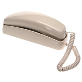
I remember my high school typing teacher, Mrs. LaPorte, insisting on two spaces after a period. We learned this while using our cutting-edge (electric!) IBM Selectric typewriters. And, I also remember talking on my Trimline telephone with the curly cord, making a mix cassette tape, and wearing my high-waisted, bell-bottom jeans. Just because it was the style at the time, doesn’t make it right now. Typing two spaces between sentences really went out of style with the advent of the computer.
Heraclitean’s argument for keeping the two spaces is, “The ‘standard’ of one space is maybe 60 years old at the most, with some publishers retaining wider spaces as a house style well into the 1950s and even a few in the 1960s.”
OK, people, even if it was as late as the 60s, that’s still 50 years ago! Might as well put on your suspenders and saddle shoes if you want to really get into the retro feel while you type your double spaces.
2. Double spacing bloats website code.
Do you know that no matter how many spaces you type, your web browser will only read the first, and then ignore the rest, leaving only one space? In order to get around that, you have to type a special code to make two spaces appear. Instead of just typing a since space character, you must type a space followed by . This effectively turns the one character necessary to separate sentences into seven characters. Multiply that by the number of sentences on a page and you have a browser-slowing mess. And, in my professional experience, working on web pages filled with codes makes for slow, painful editing. Have some pity on web developers.
3. Double spacing is inelegant.
Double spacing introduces white holes throughout the even grey that your document should have. One of my typography teachers called these holes from double spacing “rivers running through your work.” As Manjoo states, “A page of text with two spaces between every sentence looks riddled with holes; a page of text with an ordinary space looks just as it should.”
4. There’s no reason for them.
Double spacers claim that extra spaces improve legibility, but studies have shown that the number of spaces between sentences does not affect legibility.

5. Double spacing makes you look out of touch.
Now if you are trying to make a fashion statement that you are retro-cool, like wearing bow ties or using a fountain pen, go right ahead and keep typing the corny double spaces. Just consider that doing so does not improve legibility, aesthetics, nor page loading. If you want to appear modern, elegant, and sleek, one space is cleaner, flows better, and it requires no extra work. The Elements of Typographic Style (Robert Bringhust, 2004) advocates a single space between sentences, noting that “your typing as well as your typesetting will benefit from unlearning this quaint Victorian habit.”
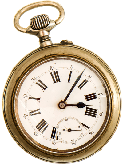
Ooh! I see by my pocket watch that it’s time for me to board the aeroplane. I do hope the motor car is waiting for me when I arrive!
With the greatest esteem and respect, I am, dear reader, your most obedient and most humble servant,
![]()