I turned off email images for a month …
… and here’s what I saw:
I think I’ve been pretty spoiled when it comes to reading emails, as I have a Mac, an iPhone, and an iPad, and emails pretty much look great on all three. The default setting for all three is to download images for emails, so if the sender has included an image, I will see it when I read the email.
One-third of people don’t see email images, either by default or by choice
There are two common reasons why you might turn email images off, even if it’s on by default in your email client. One is to keep your email private from spammers. If you do not click on any links, the only way a sender can know that you’ve seen their email is if you load the images. The second reason is for speed. If you do not download the images with an email, it will load more quickly in your email program. With the move to mobile, many people may turn off image rendering on their phones to save time … and to save money on limited data plans.
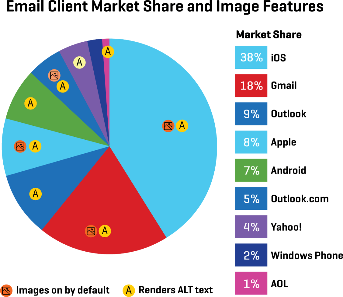
ALT text makes emails legible even without images
Ideally, an email designer should give every image an ALT tag that provides the same information as the image. That way, if someone can’t see the image, they will still know what it was. I was curious to see how many emails I received in a given month didn’t include ALT text, so for the month of February, I changed my settings to stop automatically downloading images in email.
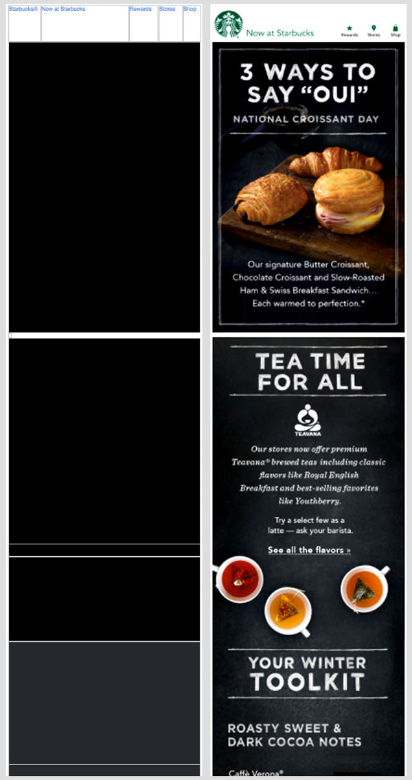
There was a shockingly high number of emails that looked terrible without images, many with just a few ALT tags here and there, and many with no ALT text at all. The emails that failed to provide a good experience without images fell broadly into four different groups: no ALT tags, repetitive ALT tags, undescriptive ALT tags, and over-engineered emails. Below are a few examples of each. (You can click on the images to see them larger.)
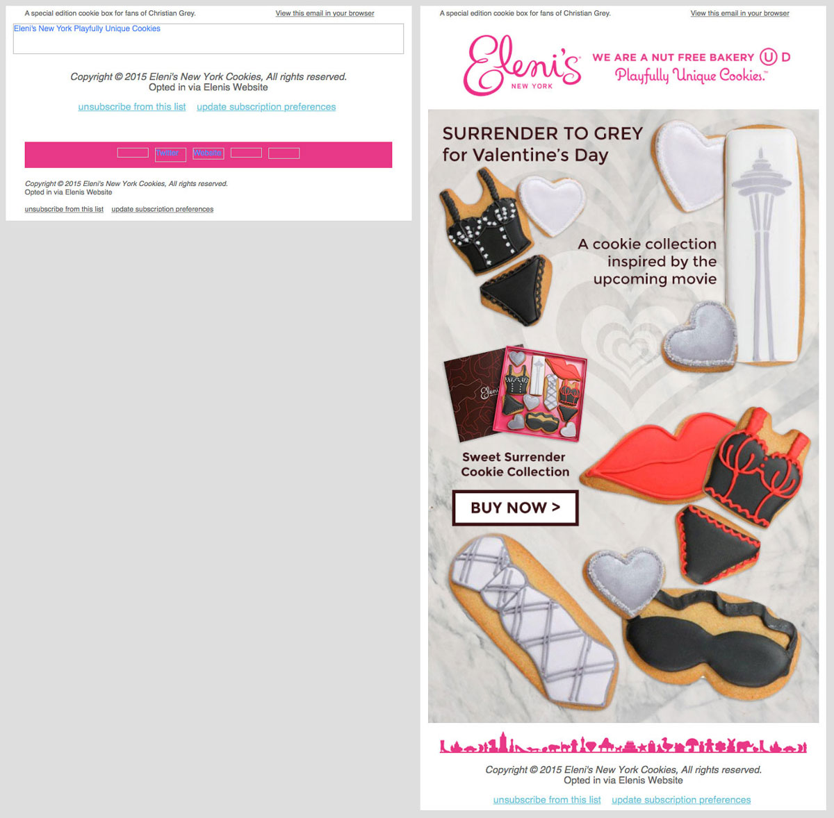
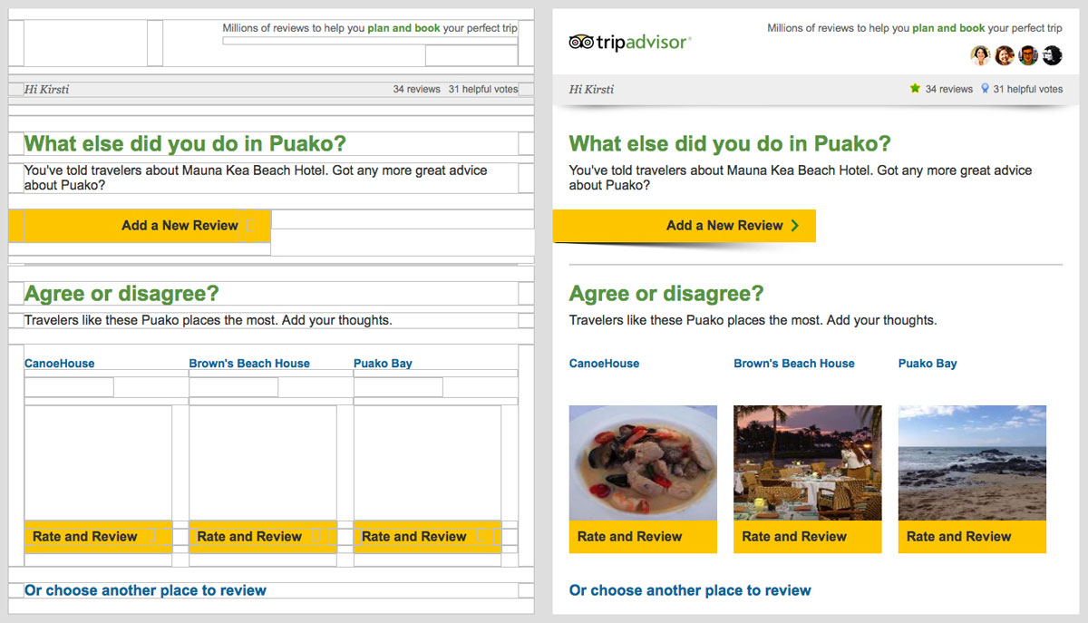
Example 1: No ALT Tags
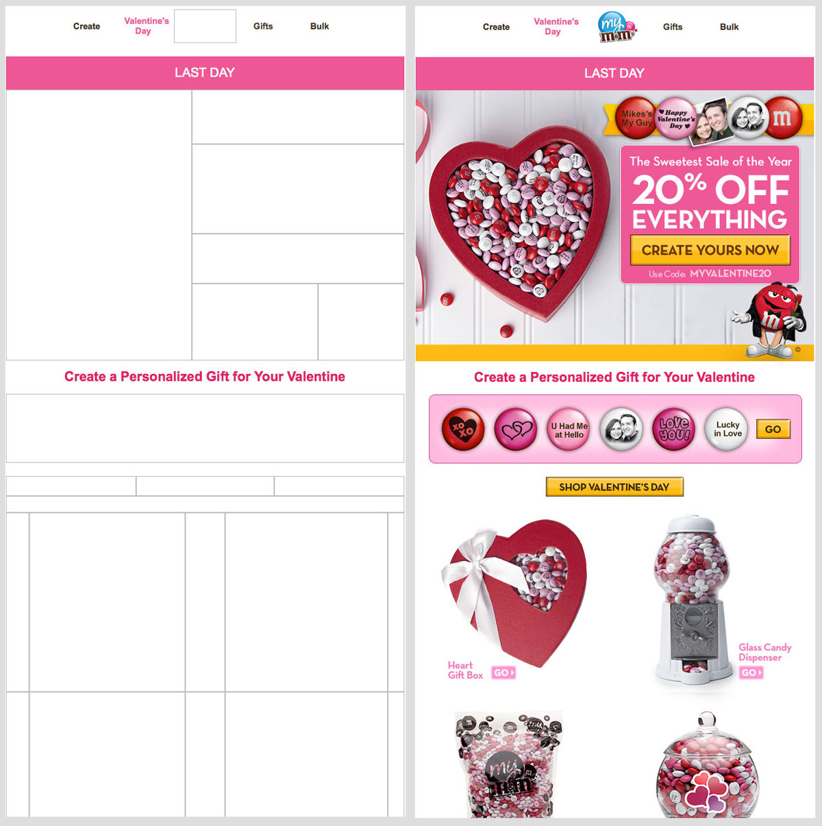
Same with the email from M&Ms. All I got was that it was the last day to create a personalized gift for my Valentine, but nothing about the special 20% offer, nor what the items were. They didn’t even put an ALT tag on the logo so I could see who it was from without looking at the “From:” line in the email.
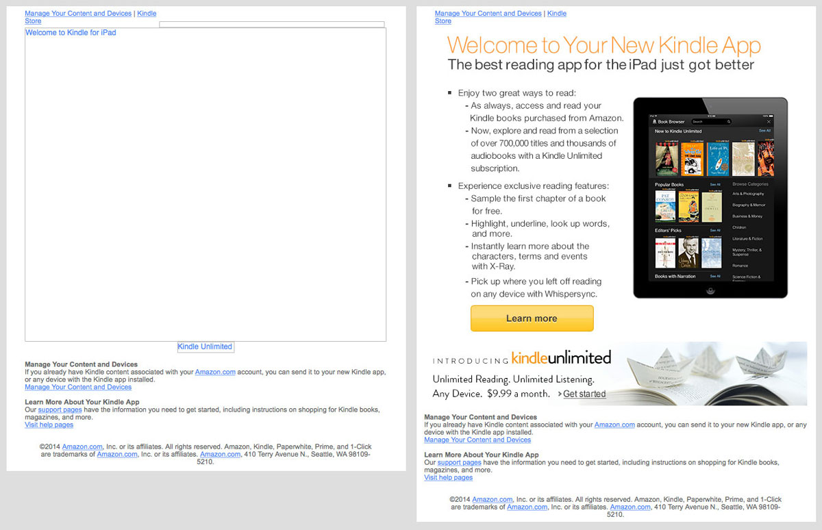
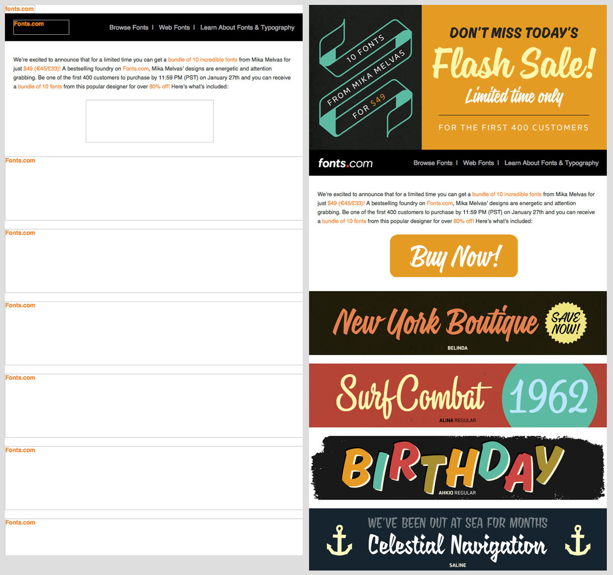
Example 2: Undescriptive ALT Tags
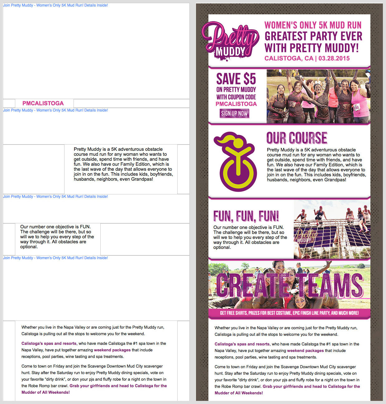
Example 3: Repetitive ALT tags
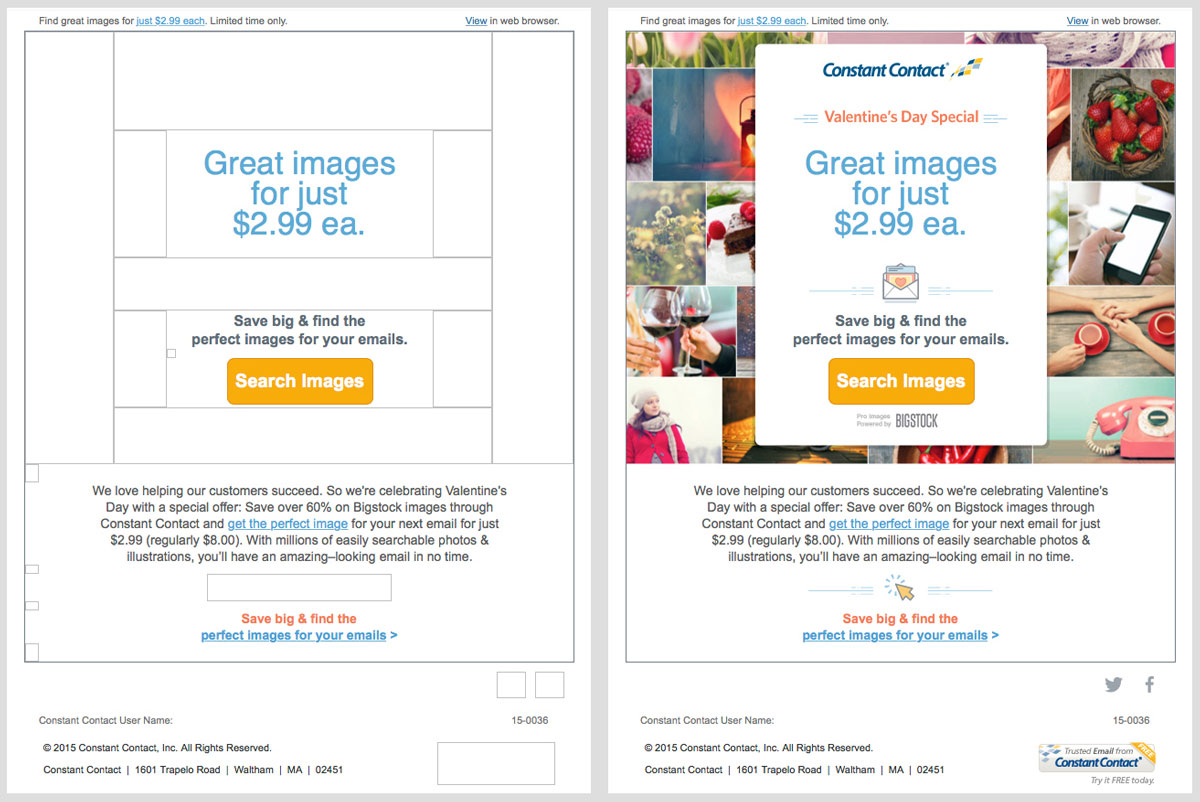
Example 4: Over-engineered emails
A quick caveat
When writing the ALT text, be descriptive but concise. If the ALT text is too long and is wider than the image box, it will not appear. So, be sure you use text that’s clear but not wordy, especially for mobile readers who will be seeing smaller image containers.
Think of your readers
As soon as February was over, I was very happy to change my email setting back to download images. The experience was a great reminder that the people reading an email or visiting a website might have a very different experience from me, depending on their setup. It doesn’t really take much to include ALT text in your emails, and in order to be responsive and look good on mobile, your emails shouldn’t be over-engineered, anyway. So, take the time you spend nitpicking the placement of email content, and instead put it into creating better ALT text. You’ll probably get a better result. Hopefully we can learn from these emails and make sure that we use the power of the ALT tag to make the emails work for everyone.