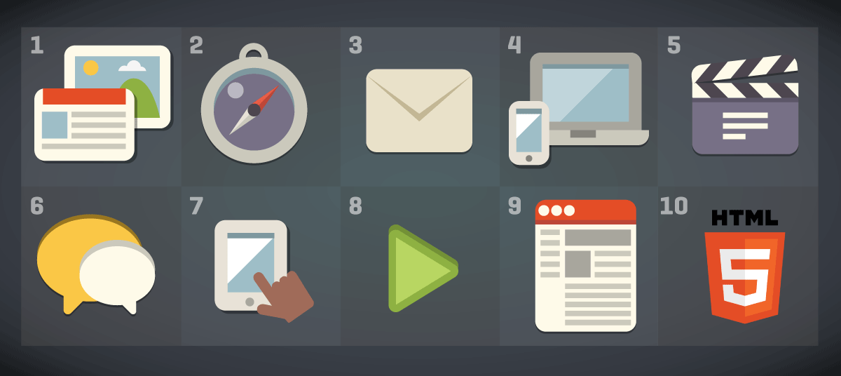
Top 10 online marketing trends for 2014
With 2014 just beginning, it’s a good time to examine some of the hottest trends in online marketing and web design. And here at Scott Design, we’re passionate about helping clients succeed, so we want to give our take on the most relevant technologies and strategies.

1. Content marketing is king
No surprise here. Marketing professionals and SEO experts foresee content marketing continuing to be a major part of marketing campaigns. We agree with the goal of continually creating relevant content for customers and prospects. The challenge is determining what’s truly relevant; the key to success is high-quality storytelling that shows you understand the audience’s needs. Want more site visitors? Create compelling, worthwhile, unique content on a regular basis.

2. Focus on mobile marketing
It’s all about rapidly rising mobile usage rates, both for visiting websites and viewing emails. You should follow responsive design strategies so mobile email recipients and website visitors can view optimized content. And mobile campaigns should include personalization, and include location-relevant content, as more users take advantage of “in the moment/on the go” calls to action and searches. Designers and developers of online marketing have to keep mobile in mind from the start for all our projects.

3. Email marketing produces results
In a social media-crazed world, well-written, targeted emails still have an impact. And you can easily track the success rates of your email blasts, testing along the way with different versions of the email. Same old rules apply, though: It’s all about the list and the offer — make sure there’s a good match. Make the move to responsive design so mobile users can view the email content with ease. And finally, always be mindful that truthful, to-the-point subject lines make all the difference.

4. Responsive web design wins out
RWD has become a web standard, since users want to easily access information on websites, regardless of their screen size. Whoever updates the site saves time with updating content once, rather then maintaining multiple versions of a site, each designed for a specific screen size. And, of course, there’s always a chance of new devices at new sizes; a responsive website is ready for that.

5. Video will continue to expand
It’s certainly no surprise that video is more popular than ever. And there’s nothing wrong with expanded use of it, as long as the content is valid, well-produced, and provides value. If you can get a user to view a compelling video, you may be able to tell your story in a couple of minutes. So keep videos short and sweet for quick download and short user attention spans — as an option to wading through pages of site content.

6. The social media landscape
Organizations will continue to integrate social media into marketing campaigns, but the list of possible sites (depending on target audience) has grown from the Facebook/ LinkedIn/Twitter triumvirate to a multitude of options, now including Pinterest, Google+, Tumblr, Instagram, and more. The challenge, as always, is finding which sites your audience uses and then creating relevant content that engages users.

7. Mobile design elements
With a focus on mobile first, even sites designed for desktops are featuring large buttons and “hidden” menus, but no hovering over selected links (since that’s not possible in the cursor-less world of mobile). There’s more of a focus on swiping and scrolling. Not the worst trend, but there’s no reason to desert mouse-and-cursor desktop users — with a well-designed responsive website, you can have the optimal features appear for both desktop and mobile.

8. Less skeuomorphism
Skeuomorphism means emulating objects that exist in the physical world; for example, creating a button that looks three-dimensional. Designers have been moving away from that look over the past few years, and Apple was the latest when they created iOS7 with flat, non-3D icons and interface. This simple design style makes sense in a digital environment, especially in a small screen or an already busy website. For example, you don’t have to present video in a video player graphic — just embed your video where you want on the page and superimpose an arrow on it. Site visitors are now used to digital experiences; they no longer need usage clues from the physical world.

9. Lots of scrolling
This trend of having a lot of information on a single page instead of breaking the content up into many pages will definitely continue. Realizing that more mobile users are scrolling through content plus the fact that some users are generally unwilling to dive deeper into a site, many sites provide a significant amount of content on each page, requiring the user to scroll through “pages” of content. An innovative navigation, such as a fixed location navigation where the navigation is always visible no matter how deep your scroll, can make these long pages user-friendly.

10. HTML5 in the post-Flash world
With the decline of Flash, many websites have begun to include less animation and interactivity. However, with the ascendancy of HTML5, more web designers and developers will use HTML5 to add animation. If animation supports telling your story, that’s great. If it’s just eye candy to pump up visual interest, you may want to leave it out for now.
We’ll be watching — and taking action
Throughout the year, we will be watching these and other trends as we continue our discussions with organizations that are looking to improve their websites, emails, and landing pages. That said, design and content of a site or email campaign should always be driven by an organization’s positioning to reach its target audience, not by what’s currently trendy.