Using type on the web like an expert
How you use type on the web is just as important as how you use it in print, but many web designers ignore even the most basic rules of typography.
Good typography makes your content easier to find and read. Bad typography tires your reader and can make site visitors leave your site. Here’s a quick rundown on how to use type like a pro on your website.
Typeface selection
There are five web-safe fonts that work on most Mac and Windows browsers. Here are the reasons you might choose one over the others:
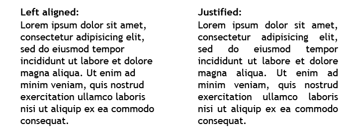
Alignment

Column width
If your columns are too narrow, you break up your sentences into too many pieces, which slows down reading. If your columns are too wide, it is hard to move your eye from the end of a line to the beginning of the next line and you can get lost. Ideal line length for the web is approximately 12 words or 66 characters, however if a user changes the browser’s default font size, the number of words that can fit in a column changes. It’s best to use a measurement that changes depending on the font and size, such as an “em,” which is the width of a capital “M” in any given font. Setting the column width to 30 ems usually gives you the optimal column width no matter the type size.
Color

Backgrounds
Use enough contrast between the background color on the page and the type. Colors that are too close in darkness are hard to read. Don’t put type on complex backgrounds or images with a lot of contrast or it will be difficult to read.
Smart punctuation
Professional typographers always use typographically correct punctuation on the web, including “smart” quotes and apostrophes, em and en dashes, and ellipses. Don’t use inch and foot marks, hyphens, and triple periods when you can use the real punctuation.
Amateur moves
These are web design choices that will instantly mark you as an amateur designer:
- Use of non-web-safe fonts
- Justified type
- Columns that are too narrow or too wide
- Too many colors
- Background color that’s too close to the text color
- Inch and foot marks, hyphens, and triple periods
- Two spaces between sentences
- Writing in all caps
Hopefully, this information has given you ideas about using type to strengthen your own website. Following basic rules of good typography can help produce professional-caliber results.