Why ignoring mobile is crazy
If your mobile strategy is to just hope people stop using phones to look at the web and emails, you’re crazy! Today, more emails and websites are read on phones and tablets than on computers. If you make your site and emails mobile-friendly using responsive design, you’ll reach more customers than ever.
Web designers and the companies that hire them need to start thinking and working differently to make their sites accessible on the ever-growing combinations of devices and window sizes. If you don’t, your customers might never see your site, and might click away as soon as they see your mobile-unfriendly site.
It’s simple, really: The easier you make your sites and emails to use on mobile, the happier your customers will be.

Overview: What’s in it for me?
If you’re a business owner, you need to know how responsive design can help you reach and keep more customers, extend your brand, and improve your bottom line. If you’re a designer, you need to know the best way to design and maintain websites and emails. It’s called “job security,” people.
We’ll give you an introduction to a way of working that will:
- Get you better search engine results
- Give users a better experience on all screens … even those not yet invented
- Make your web and email design more efficient and less expensive
We’ll show you how to get a competitive edge as the world moves to mobile computing.

Early design: fixed screen size
In the beginning, the only place to see a website or read email was on a computer at your desk or on a laptop. Most users’ browsers and email client windows filled up the whole computer screen. You could have safely assumed that most of your audience used Internet Explorer and Microsoft Outlook on a Windows machine.
With one screen size, everyone had basically the same experience with websites and emails.
That’s not the case today.

Say Hello to iPhone
Then came the iPhone, and overnight, everything changed. While early smartphones had lousy browsers on low-resolution screens the size of a postage stamp, the iPhone provided a decent online experience. More people actually began using their phones to access websites and read emails.
And, as smartphone screens got us thinking smaller, desktop and laptop screens got bigger. Users today often resize their browser and email windows to fit how they work, so these windows might end up being tall and narrow or wide and short.
Get the message: There’s no longer a standard size or shape for a viewing screen — and there will never be one again.

Talk about an explosion!
The growth in mobile is forcing businesses to rethink how they win, serve, and retain customers.
- Mobile internet use has doubled in the past two years and makes up 28.5% of all web traffic. (3)
- 48% of Google searches in the U.S. last half of 2014 were on mobile. (4)
- More than half of all emails are now read on mobile devices. (1)
- U.S. adults spend more time on their mobile devices than on their computers. (2)
- The number of browsers, email clients, mobile apps, and web services keeps growing. (5)
Websites and emails that aren’t mobile-friendly don’t add up to good business.

Newsflash: Even business people use mobile phones!
And, it’s the same for business users. Customers expect to engage with brands to get information, make purchases, and connect with brands, immediately and everywhere.
- 92% of execs use smartphones for business tasks
- 77% of B2B customers search for business solutions on mobile
- 50% of B2B execs make purchases on their smartphones
- 13% have made purchases of up to $5,000 on mobile
- 43% say a website that is not enabled was the reason for them not to purchase via smartphone (6)
So don’t go thinking you don’t have to go mobile, Mr. B2B Business Owner.

Nowadays, everybody is Dick Tracy
As technology marches ever onward, new means of accessing the internet keep appearing. Websites have to work well not only on computers, phones, and tablets, but also on smart watches, glasses, TVs, game consoles, home appliances, and even cars. The list of devices that can stream content from the web will likely be even longer in a year. (7)
Face the future: This rapidly expanding, connected world is not stopping any time soon. Over and out.

A pleasant enough looking website
This site — for a Fortune 15 company — was designed to look good on a computer.


Don’t let this happen to you
Look what happens when someone looks at that same site in a smaller browser window or phone. You either can’t see the content because it doesn’t fit in the window, or you can’t see or interact with the content because it’s tiny!


The problem with serving up a desktop version to mobile users:
- Your content is harder to see. Users have to constantly scroll, pan, pinch, and zoom to see anything.
- It’s hard to click on tiny links.
- You give the impression that you do not care about your site…or the people using them.
- You appear out of touch and out of date.
Don’t give your customers a ready-made excuse to leave your site and find one that’s easier to use.

Two sites = Twice the headaches
To accommodate mobile users, companies started creating two versions of their websites, one for desktop and one for mobile. Or creating a desktop website and mobile apps for different devices (iPhone, iPad, Android, Windows Phone, Blackberry, etc.). This is incredibly wasteful and inefficient:
- Every time you update one site, you have to update the other, or update the multiple versions of your app.
- You have to maintain (and pay for) twice as many servers and different types of programmers.
- You confuse the heck out of search engines. (Google actually penalizes you for having duplicate content.)
- Mobile apps don’t drive traffic to the web.
- You don’t give users a consistent brand experience across devices.
- Ever had someone send you a link to a mobile site while you’re on your desktop? Annoying, ain’t it?
Avoid the headaches of multiple websites and apps: Fix your existing site to make it look good on any device.

Responsive Design to the rescue!
Instead of creating layouts at a fixed size, or creating one version for computer and one for mobile devices, we can use responsive design to lay out great-looking sites and emails that work on all devices and are accessible to everyone. The goal of this “one web” approach is to make it easy to see your website and emails on the biggest and smallest of screens with a minimum of resizing, panning, and scrolling. There are three main components to this kind of approach:
- A fluid grid
- Flexible images
- Media queries
Responsive design ensures that content re-flows and configures to fit any viewport size.
Kind of like having your ice cream in a cone, a cup, or in a sundae dish with all the toppings.

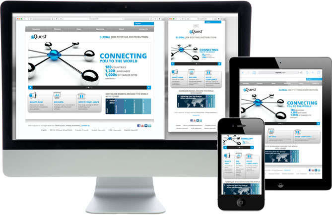
Check out this website that work at all shapes and sizes, thanks to responsive design:
First thing, let go of the idea of complete control
In order to accommodate the vast variety of devices and window sizes, we need to give up the idea that we have total control over how our websites look. (Indeed, we probably never did; but at least when everyone used a desktop or laptop to view our sites, we could fool ourselves into believing that everyone was seeing more or less the same layout.) Fixed-width layouts, where items are placed precisely on a page, are pretty much a thing of the past.
In exchange for ceding rigid control of your layout, you will gain a flexibility that allows your content to shine no matter how it is viewed. For instance, instead of using pixels, use percentages for the widths of your various content areas. Establishing this flexible grid is one of the first steps in making your site responsive.
Go responsive and let your content fly free.

Less is more
Since it’s likely that many people are going to eventually view your site or email on a mobile device, think about them first. When customers visit your site on a phone, you don’t want to make them wade through a bunch of fluff to find what they’re looking for. And, when they read your email, you want them to get the most important message right away, so the most important info should be “stacked” first for mobile. Thinking mobile first forces you to streamline your content to get it down to just the essentials.
Don’t make them eat a full meal if they just want dessert.

Get right to the point
Once you’ve purged the fluff from your content, it’s time to start prioritizing it. With your content in order (literally and figuratively), you can use responsive design to optimize your layout depending on the viewport. You can write code to put your most essential and interesting stuff near the top of your page or email; then put content that is less essential lower on the page (or on a sub-page). Whether your customers are on a smart phone, or sitting at their desk, they’ll appreciate it. All site visitors need to do is scroll — no pinching and zooming — to quickly see all the content.
If you upset your site visitors, they’ll leave faster than a starship at warp speed.

Update your CSS
Changing your site to be responsive can be complicated and involves a bit of a learning curve. If you’re already using CSS and semantic markup properly, adding the media queries to your CSS that make your site responsive will be a lot easier. Once you figure out where your “break points” are, (that is, the window widths where your layout is going to change), make sure that:
- Fonts are legible at all break points.
- Touch elements (such as links and form fields) are large enough and spread out enough so they’re easy to tap on mobile. Think large, “tappable” CTA buttons.
- You’re not relying on any plug-ins such as Flash for important functionality or content.
- Users don’t have to scroll from side to side, or pinch to zoom in and out, to see everything.
Where you’ll save money in the long run is by making updates and additions to your site easier with only one version to maintain. And, by keeping mobile visitors on your site longer, you can start to see a ROI on your investment.
You have a license to code a clean, responsive site.

Let it flow
Responsive design lets you create a set of rules for how the content should be displayed as the viewport changes.
For example, on a wide desktop browser, your content could be arranged into four columns, yet as you narrow your window, it could switch to two columns; and then to one column as it is narrowed down further. The order of the items in the columns is determined by a logical flow through the most important to the least important items.
This way, no matter what device your customers use, your content is easy to read, your site easy to use, and your message is loud and clear. One set of content, one set of rules on how to show that content on different screens, one unified experience across devices.
Just like magic.

Search engines love responsive web design
Using responsive designs for your website means you’ll rank higher in search results than if you have a desktop-only website or two versions of your site.
- Google ranks responsive sites higher and even labels them “mobile-friendly” in search results. (8)
- Google punishes duplicate content, such as the two sets in desktop and mobile versions. (9)
- With only one page featuring each piece of content, all links to that content go to one page; they aren’t split between desktop and mobile versions.
And, more important than search engines loving responsive web design, your users will love it.
Go mobile — and have the site that everyone falls in love with.

If more emails are read on phones, why are you still designing them for computers?
The same principle applies to your email communications: You want to make sure that any emails you send out look as good on mobile devices as they do on desktop computers. The fact is, responsive emails get a better response:
- The first link in a responsive email gets 30% more clicks than the first link in a non-responsive email. (10)
- Responsive emails get 15% more clicks overall than non-responsive emails. (10)
- 98% of enterprise email marketers are using or plan to use responsive email design this year. (11)
Don’t let customers break up with you over hard-to-read emails. Your mobile-friendly competitor is waiting to pick up the pieces.

You are not your audience
With so many different viewport sizes, devices, browsers, and apps, the job of testing websites and emails is getting harder every year. Don’t just look at things on your computer or phone. Test in as many browsers, email clients, and devices as you can.
- Test on a desktop Windows computer, a desktop Mac, a laptop, a tablet, and different phones.
- Make your browser windows wide and narrow to see how it looks when users change the window size.
- Test on the latest versions of the most popular browsers, email clients, and web-based email services.
- If there’s some browser, app, site, or device that your particular customers use, be sure to test there.
The hard work pays off: More testing = More happy users.

What are you waiting for?
Responsive design is the best way to reach customers everywhere online. And, it’s just starting to take off.
- The number of top-ranked websites using responsive design doubled last year. (12)
- 58% of retailers rank mobile as a top priority this year. (13)
- More than a third of U.S. small businesses plan on overhauling or rebuilding their websites this year. (14)
It’s time to switch to responsive design and carve out a competitive edge … while you still can.

Any questions?
Obviously, we can’t cover everything you need to know about responsive design in a single sitting, but hopefully this information gives you a head start. And, if you’re ready to update your site for your growing mobile audience, we can help. Feel free to contact Scott Design if you have questions or suggestions about going mobile with responsive design, or leave a comment below.


TL;DR:
Too long; didn’t read: Are you someone who needs to learn about this but will never read that much copy? Read the article in bite-sized nuggets on slideshare»
Sources:
- 53% of Emails Opened on Mobile; Outlook Opens Decrease 33%
- Mobile Now Exceeds PC: The Biggest Shift Since the Internet Began
- Mobile internet usage soars by 67%
- Why Mobile Web Still Matters in 2015
- Gartner Says Worldwide Traditional PC, Tablet, Ultramobile and Mobile Phone Shipments to Grow 4.2 Percent in 2014
- Evolution of Business: The Mobile Executive (IDG Knowlege Hub)
- Cisco Visual Networking Index: Global Mobile Data Traffic Forecast Update 2014–2019
- Helping users find mobile-friendly pages
- Duplicate content
- The Science of Email Clicks: The Impact of Responsive Design & Inbox Testing
- The Forrester Wave: Email Marketing Vendors, Q3 2014
- Responsive Web Design Adoption, 2014
- Mobile Still Tops Retailers’ Priority Lists, According to Shop.Org/Forrester State of Retailing Online Report
- 2015 Will Be a Banner Year for Small Business Websites
(Most) illustrations by Paul Gilligan