Designing responsive websites
From a web designer perspective, responsive design provides new challenges. Establishing a look and feel for the site is just the beginning. A design team should think about the different experiences for each user (laptop, desktop, tablet, and phone) and determine what’s optimal for each.
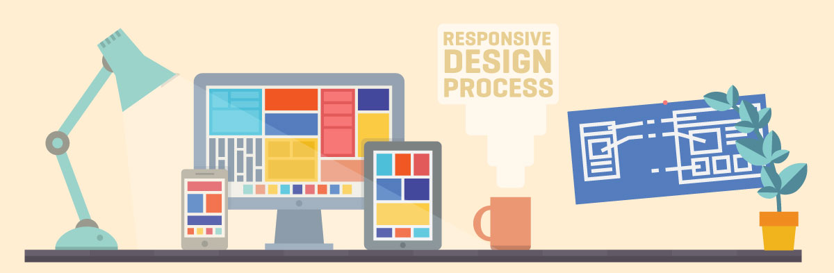
The responsive design process
For example, a horizontal navigation looks great and works well at the desktop size, but an optimal smartphone experience will more likely require a vertical navigation, possibly in a pull-down menu that uses a common, built-in style for that particular smartphone (iPhone, Android, etc.). Or certain images might look great at the larger screen size, but at a smaller screen size, those images will have to be reduced in size, or even removed completely.
A key discussion among web designers centers on where to start when working on initial concepts. Does the team work on desktop ideas first, refine the design for each concept, and then create corresponding mockups for the smaller screen sizes? Or maybe start with the handheld size — which is often the most challenging — and then only create the larger sizes when the smallest size is nailed down?
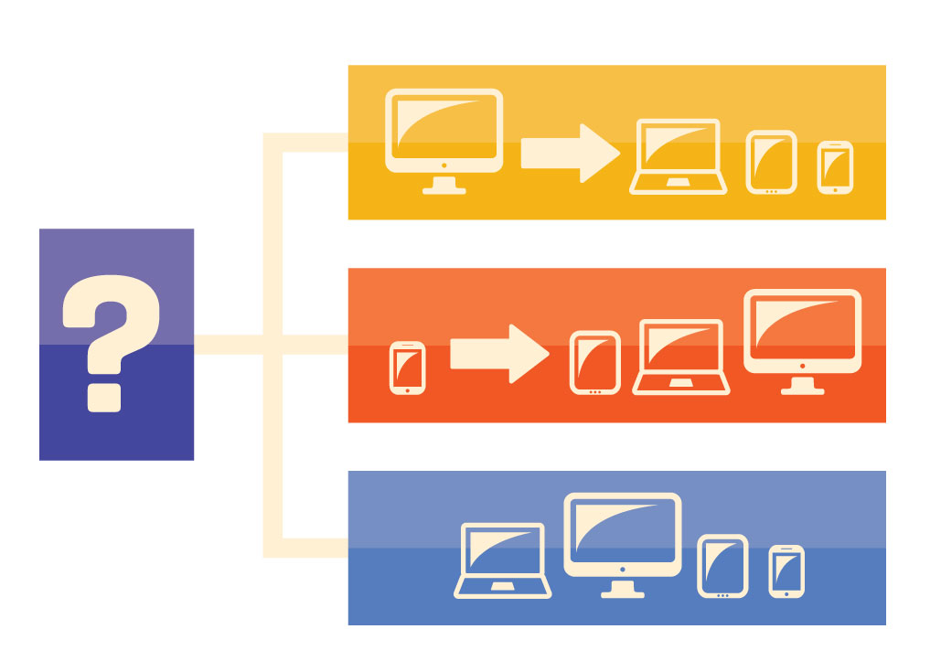
Option 1: Start with desktop design first
Overall, it’s perfectly fine to start the design process by mocking up what the desktop size will look like. Creating larger-size concepts at the beginning allows the more traditional creation and presentation of design ideas to determine the overall look and feel of the site. The larger viewing screen offers more options about where content will appear, horizontally and vertically on the page, so the desktop design does allow more creative options.
Option 2: Start with handheld design first
While you can start with desktop, it’s actually better to start designing for mobile users. Smooth functionality and fast downloads at the mobile size are key objectives, and these considerations shouldn’t limit options for design ideas at the larger sizes. Mobile-first design also forces you to priotize and edit your information, which is also beneficial to your desktop users.
Option 3: Design both at the same time
The reality is that you really should think about all the sizes from the beginning. Before designers spend too much time on the concepts, they should mock up what the designs will look like and how they will function on both desktop and mobile devices. The team has to constantly think about how each element of the design will scale down elegantly, and continually ask questions: How will the navigation and sub-navigation work/look at the mobile sizes? Are those large images essential to the design, or can they removed at the smaller sizes? Which content should be highlighted in a mobile version? How will the hierarchy of content be preserved for the different sizes?
When designing at either size, think about the desired content and keep in mind not only how that content could be modified at different sizes but how the established look and feel of the site will be supported at that size. Design elements such as colors, fonts, and graphics at the desktop size should be included when possible at the tablet and smartphone sizes. Often a decision is made to strip out content at smaller sizes, but there are fairly elegant ways to present all the relevant content at smaller sizes, while retaining the established design.
Generally, design teams that have completed numerous responsive design projects are more confident starting with the desktop version, since they have made similar “scale-down” decisions before. As long as mobile and tablet are being considered — and supporting mockups follow the initial designs — starting with the larger viewing size screen can work well.
Important: Include the developers during the design phase
Design teams with developers on board have a distinct advantage in the design process. If developers participate while designs are being created, they can help think about how the design and functionality will scale down at the mobile sizes. They won’t let the team go down a design path for which there’s no reasonable solution at the smaller viewing screen sizes. If your design team doesn’t have a developer, it’s a good idea to include one early in the design process.