For crying out loud, make a mobile-friendly website already!
The world is moving to mobile. What are you waiting for?
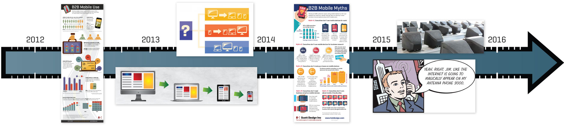
In 2012, we created a B2B Mobile Use infographic explaining why devising a mobile strategy should be a priority for your business. As we said back then, “…Determine how many visitors use mobile devices to access your site by checking Google Analytics. But, without a doubt, those mobile numbers are going to grow over the next few years, as more and more customers use mobile devices to research and make their B2B purchases.”
In 2013, we wrote a quick post explaining responsive design, and how it works to optimize a web experience for all users, from desktop to laptop to tablet to phone. We also wrote about the responsive design process, and how your web designer should be thinking about both mobile and desktop early in the design process.
In mid-2014, we shattered a few B2B Mobile Myths with an infographic that dispels some of the misconceptions that companies have about where customers are viewing their websites. In the article, we shared data showing B2B decision makers use their mobile devices for business, gathering information, conducting research, and buying products and services for their organizations.
Last year, we got tired of trying a reasonable approach to encouraging clients to create mobile websites, and wrote about Why ignoring mobile is crazy and shared all the reasons why it makes sense to be mobile-friendly. In late 2015, we shared our 5 worst excuses for not having a mobile-friendly website after hearing the same justifications, again and again, about why companies were failing to embrace mobile for their websites and emails.
 So, it’s now 2016, and we still hear some organizations asserting that their customers don’t use mobile enough to worry about a mobile-friendly website. How long will it be until the message to think about your mobile visitors FIRST sinks in? Today, more people access websites and emails on mobile devices than on desktop, including those making valuable buying decisions on everything from personal to corporate products and services. And if you’re site isn’t responsive, mobile users searching on Google will be less likely to find you since Google rewards mobile-friendly sites in search results.
Your customers are ready to connect with your business on all types of devices and screen sizes. What are you waiting for? Take advantage of this huge opportunity by making it easy for them to interact with your website on their handheld devices…before your competitors do.