
A high-end interior designer needed to update her website for mobile optimization and to add new content. Thanks to responsive design, site content is now optimized for both computers and mobile devices.
Tag: digital marketing
Adobe campaign emails and landing pages

Scott Design created a series of responsive emails and landing pages targeted at driving specific customer groups to view promotional materials.
Structural engineering firm website wins design awards

Design awards in corporate, B2B, and construction website categories
Why ignoring mobile is crazy

If your mobile strategy is to just hope people stop using phones to look at the web and emails, you’re crazy! If you make your site and emails mobile-friendly using responsive design, you’ll reach more customers than ever.
Responsive website redesign for HIRC

Reaching prospects and communicating with subscribers prompted HIRC to redesign its site, establishing a modern and responsive online presence.
I turned off email images for a month …

I was curious to see how the emails I received in a given month looked without images, so I changed my email settings to stop downloading email images. I share examples of the four general types of emails that suffered without images.
Why tables for layout is stupid: Updating a fan favorite

“Why tables for layout is stupid” has been one on our most popular articles since it was published in 2004, with hundreds of thousands of visits and 24 international translations. Since more people access the web on their phones than from their desks and Google rewards mobile-ready sites, we decided it was time to update “Stupid Tables” to make it responsive.
The ABCs of SEO

Making sure your site is at the top of search results is the best way to ensure a steady stream of visitors. Follow the ABCs of SEO, and your website will start its rise to the top of the rankings.
Worldwide email client market share
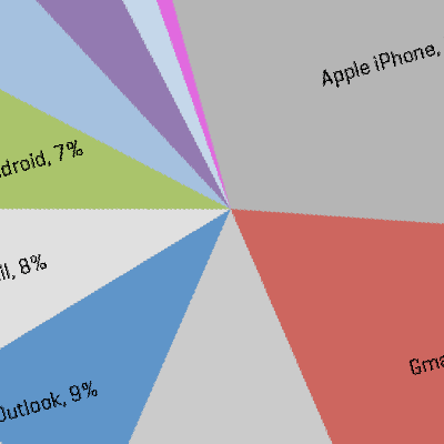
It’s good practice to keep up with the latest information on how people are interacting with your digital marketing. Check out the most popular webmail, desktop, and mobile email clients, compiled from data collected from 1.16 billion email opens worldwide.
Increase email open rates with better subject lines

It doesn’t matter how well written or well designed your email is — or what a wonderful offer you are presenting to a perfectly segmented list. If the subject line doesn’t compel the recipient to open the email, then there’s no interaction with your content. Read eight ways to make sure your email subject line speaks enough to your audience members for them to want to read further.
Which emails do you check on mobile devices?

We asked our colleagues if they check their business-related emails on their phones. The results confirmed the reports: Most respondents, regardless of their age, use their phones, tablets, and other mobile devices to check both their personal and work emails.
Making sure your responsive emails work everywhere

We’ve provided a few pointers to help you make sure your emails work for everyone, no matter where they’re reading them.