
With 2014 just beginning, it’s a good time to examine some of the hottest trends in online marketing and web design. Here’s our take on the most relevant technologies and strategies to watch and implement this year.
Tag: mobile-friendly
Responsive email design

With so many users viewing sites on smartphones and tablets, ensuring engaging mobile experiences has become essential. Now, the responsive design strategy is being applied to emails, since more and more users worldwide view emails on mobile devices.
B2B Mobile Use infographic wins gold
Gold Marcom award in the infographic category
Designing responsive websites
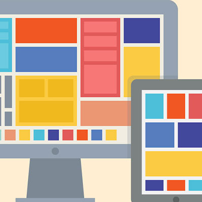
From a web designer perspective, responsive design provides new challenges. Establishing a look and feel for the site is just the beginning. A design team should think about the different experiences for each user (laptop, desktop, tablet, and phone) and determine what’s optimal for each.
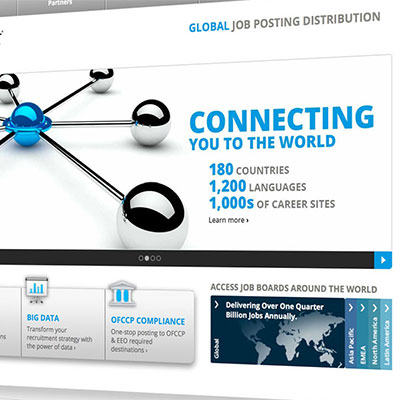
Adobe Web Tools Selector
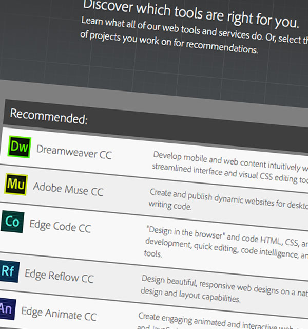
Helping customers figure out which software is best for them can be challenging, unless you have an online tool that provides instant recommendations.
What is responsive design?
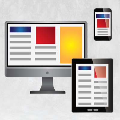
Responsive design refers to a website’s layout and content changing, depending on the size of the user’s viewing screen. This adjustment optimizes a web experience for all users — from desktop and laptop users to tablet and smartphone users.
Adobe Connection newsletter-authoring tool
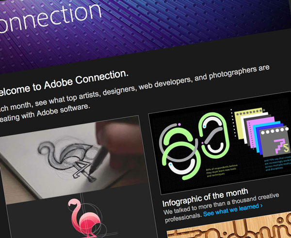
Creating multiple targeted and customized newsletters is much easier with a custom, online authoring web app.
Multi-language, responsive WordPress website
A responsive, multi-language website that can be updated with ease helps eQuest communicate with their worldwide audience.
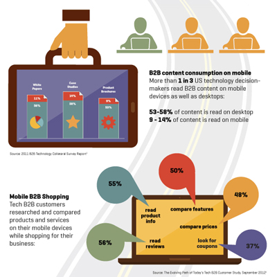
B2B Mobile Use (Infographic)
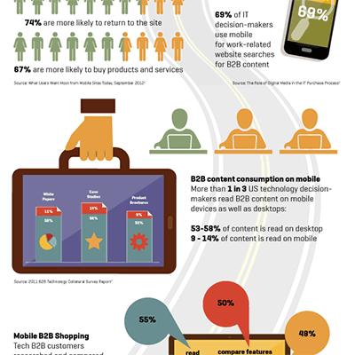
Devising a mobile strategy should be a priority for your B2B business. Clarifying what your audience wants to see and do on a small screen and figuring out how to turn that attention into revenue is critical.