
As we approach midseason for 2015, it’s a great time to assess how your digital marketing, marcom, and branding strategies are working out. With six more months in the year, it’s not too late to readjust your own playbook to pull out some digital marketing wins.
Tag: responsive
Websites, emails, apps, and landing pages optimized for desktop computers, laptops, tablets, and smartphones
Adobe Education online community
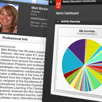
Adobe wanted to update its Education Community app to work on both mobile devices and traditional browsers. Member educators now can use the online app to collaborate across devices and stay current on Adobe events and products.
Mobile-friendly website for a mobile detailer
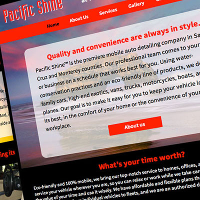
Scott Design created a mobile-friendly website with SEO-optimized images and copy to replace an outdated, Flash-based website. The new responsive design lets visitors from all devices learn about the company and schedule services.
Online email creation app wins awards
Multiple awards for microsite, web apps, and newsletters
Digital NEST website redesign
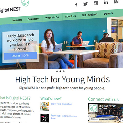
A nonprofit dedicated to bringing technology and training to underserved youth wanted to redesign its website to better reach its audiences: students, community businesses, volunteers, and donors.
Mobile-friendly website for interior designer

A high-end interior designer needed to update her website for mobile optimization and to add new content. Thanks to responsive design, site content is now optimized for both computers and mobile devices.
Structural engineering firm website wins design awards

Design awards in corporate, B2B, and construction website categories
Why ignoring mobile is crazy

If your mobile strategy is to just hope people stop using phones to look at the web and emails, you’re crazy! If you make your site and emails mobile-friendly using responsive design, you’ll reach more customers than ever.
Responsive website redesign for HIRC

Reaching prospects and communicating with subscribers prompted HIRC to redesign its site, establishing a modern and responsive online presence.
Four web and mobile awards for responsive B2B site
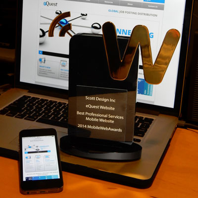
Several B2B and professional services website awards
Why tables for layout is stupid: Updating a fan favorite

“Why tables for layout is stupid” has been one on our most popular articles since it was published in 2004, with hundreds of thousands of visits and 24 international translations. Since more people access the web on their phones than from their desks and Google rewards mobile-ready sites, we decided it was time to update “Stupid Tables” to make it responsive.
The ABCs of SEO

Making sure your site is at the top of search results is the best way to ensure a steady stream of visitors. Follow the ABCs of SEO, and your website will start its rise to the top of the rankings.