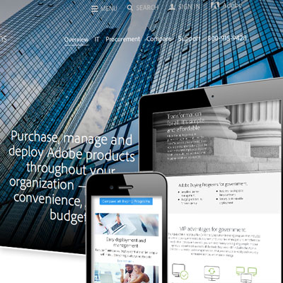
In order to effectively communicate information about Adobe volume licensing programs, Scott Design wrote a well-organized and engaging section of the Adobe corporate website.
Tag: mobile-friendly design
How does Google decide if your site is mobile-friendly?

Google ranks mobile-friendly websites higher in search results because they think a mobile-optimized website is a better “answer” than a non-optimized site.
Responsive website for solar energy company
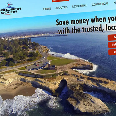
A modern, SEO-ready, mobile-optimized website designed to communicate its message and generate leads.
For crying out loud, make a mobile-friendly website already!

We still hear people saying their customers don’t use mobile enough to need a mobile-friendly website. How long will it be until the message to think about your mobile visitors FIRST sinks in?
5 digital resolutions for 2016

Now is the perfect time to take a look at your digital strategies and make some resolutions to improve your business’s marketing. It doesn’t have to complicated, but should contain a few key elements.
WordPress website for nonprofit
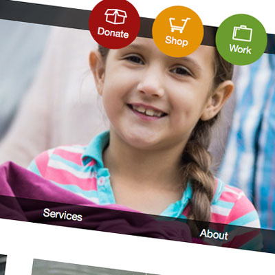
Scott Design redesigned, reorganized, and built a new custom WordPress website for Goodwill Central Coast that is visually appealing, easy-to-navigate, and is optimized for both computers and mobile devices.
Adobe Education online community
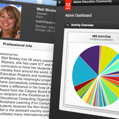
Adobe wanted to update its Education Community app to work on both mobile devices and traditional browsers. Member educators now can use the online app to collaborate across devices and stay current on Adobe events and products.
Digital NEST website redesign
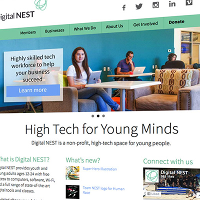
A nonprofit dedicated to bringing technology and training to underserved youth wanted to redesign its website to better reach its audiences: students, community businesses, volunteers, and donors.
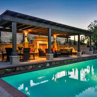
Mobile-friendly website for interior designer
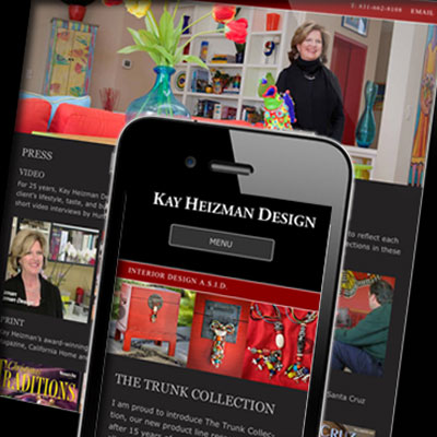
A high-end interior designer needed to update her website for mobile optimization and to add new content. Thanks to responsive design, site content is now optimized for both computers and mobile devices.
Adobe campaign emails and landing pages
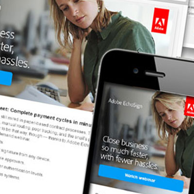
Scott Design created a series of responsive emails and landing pages targeted at driving specific customer groups to view promotional materials.
Responsive website redesign for HIRC
Reaching prospects and communicating with subscribers prompted HIRC to redesign its site, establishing a modern and responsive online presence.
WordPress website for structural engineer
McHale Engineering has years of experience, but didn’t have an online presence for reaching architects, commercial builders, and homeowners.